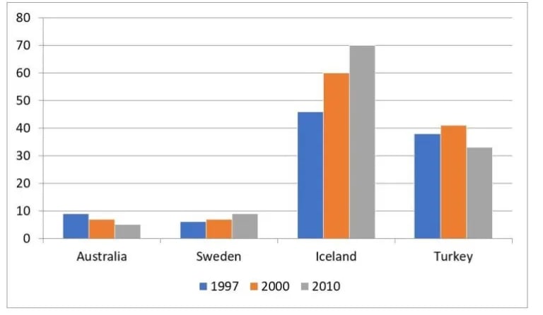
2. The chart shows the proportion of renewable energy in total in total energy supply in four countries from 1997 to 2000.
Sample Answer,
The given bar graphdepicts the information about the percentage of renewable energy with regards to the totalenergy production in four different countries (Australia, Sweden, Iceland and Turkey) in three years;1997, 2000 and 2010.
Having a myopic look, it is clear that, in 1997, almost half of the total energy produced in Iceland came from renewable resources. This figurecontinued to climb steadily to 60% in 2000 and more than 70% in 2010. Meanwhile, in 1997, onlyapproximately 5% of the entire amount of energy produced was generated from natural resources inSweeden.
Furthermore, In Australia, nearly 10% of the energy supply was from renewable resources in 1997, and this figure decreased slightly to around 5% in 2010. Similarly, the percentage of renewable energy used in Turkey experienced a decline over the years from approximately 37% in 1997 down to just under 35% in 2010.
Overall, Sweden and Iceland witnessed an upward trend in the use of renewable energy sources in thethree examined years. In addition, renewable energy was mostpopular in Iceland.
____________________________________
Contacts
megamindieltsinstitute@gmail.com
+91 98552-03014